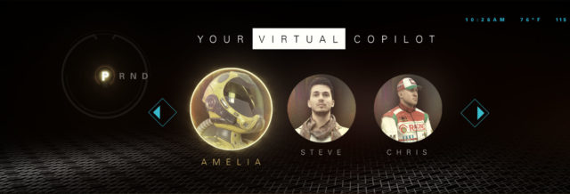
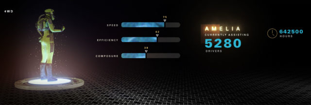
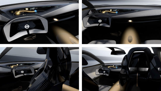
The Nissan IMs made its debut at the 2019 North American Auto Show. This fully autonomous vehicle features an extensive amount of design, animation, and UI created by Simple Creature.
Over the course of several months, we iterated through multiple concepts and rounds of design choices. After landing on this direction, we animated multiple interactions and created a series of videos to display on the vehicle’s five interior screens while on display during its auto show run.
Interior screen layout and synchronization
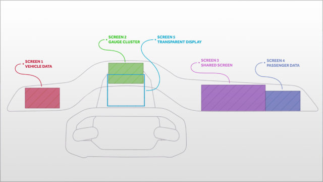
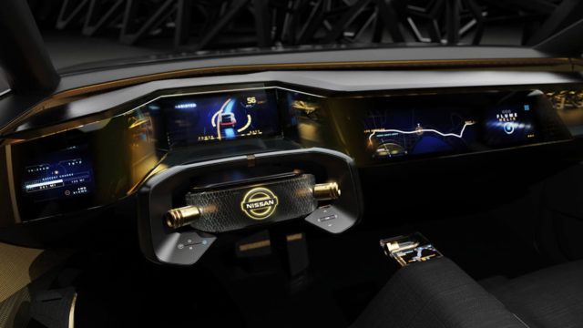
The dashboard of the vehicle is almost entirely screens. Four displays are nearly side by side, and a fifth transparent display sits between the instrument panel and the steering wheel. This screen layering provided a unique opportunity to highlight areas of the gauge cluster and take advantage of the inherent parallax between the two displays.

Design and process
Initially, the client direction was “retro future Tokyo” and we were operating in a pretty free-form way, favoring aesthetics first and functionality second. Over the course of the project, form and function became of equal importance, but starting unconstrained allowed us to fully explore wild and unconventional ideas and visuals.
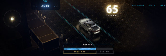
The first area of focus was on the driver’s gauge cluster screen, where information such as speed, upcoming turn direction, MPG, battery power, and ambient temperature would be displayed.
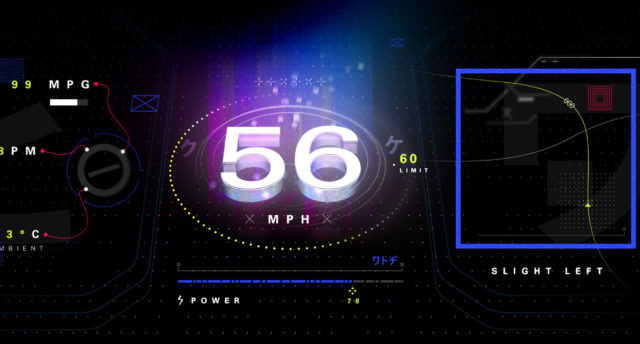
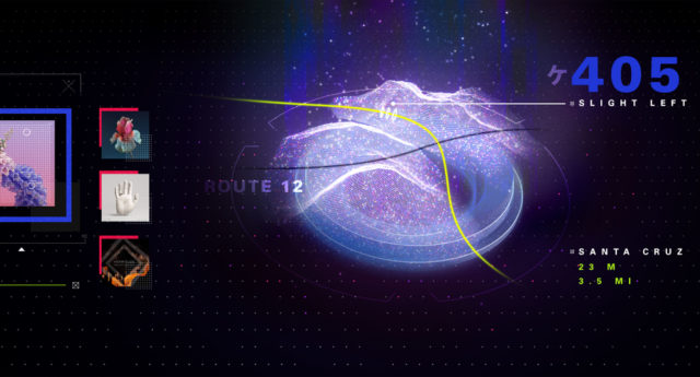
Visualizations of terrain and roadways provided an opportunity to push the high-tech aesthetic. A holographic look embodied the futuristic vibe we were shooting for.
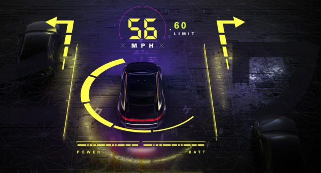
The transparent screen could only display solid color, so the forms we could manifest were somewhat reminiscent of an early digital clock. We experimented with rendering reflections of the transparent screen elements into the scene of the driver’s gauge cluster display.
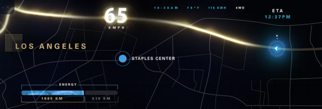
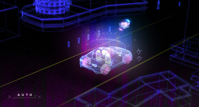
While the vehicle is in autonomous mode, the shared driver / passenger display shows a stylized view of the current location, calling out potential points of interest nearby.
Animation reel
All five screens needed to sync up with one another, allowing for UI elements to collapse and move from one screen to the next. We used an omnipresent background pattern across all of the displays. This element unified transitions from one major area of the interface to the next. The transitions were designed to share a common stopping point, allowing users to jump seamlessly from any section to any other.
AI symbol animation
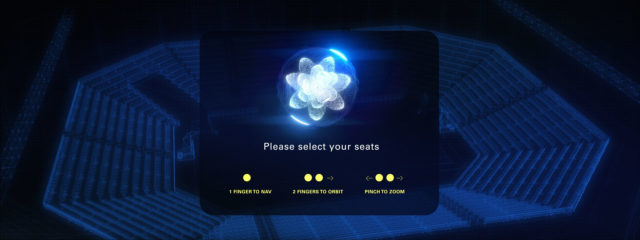
The vehicle’s artificial intelligence persona needed to have some visual form. We chose an orchid blossom to represent the vehicle’s AI. The petals opening and closing represent the AI “thinking. A unique color and camera angle distinguish the AI's different modes.
Transparent screen and gauge cluster
A key element to this project was designing an interesting interaction between the driver’s main screen and the transparent display. We explored possibilities and pitfalls of the parallax between the two displays depending on the viewing angle.
Transparent screen pseudo interaction
An interesting concept that didn’t make it to the final installation was rendering reflections within the main LED display. As the transparent screen’s elements changed, the main screen displayed a corresponding reflection creating an added sense of realism.
In-vehicle context
The placement of all of these screens can be difficult to visualize. Here you can see the proximity and interaction of the two main displays. The vehicle designers took inspiration from fighter jet navigation and targeting systems, giving more prominence to certain elements by bringing them closer to the pilot.
A second vehicle adoption
Based on the reception and success of the IMs interface design and execution, we were commissioned to adapt the design to work for a second Nissan concept car, the IMq.
